

LAS VEGAS—Trailhead Credit Union often features an image of a glass of beer on its home page. It wasn’t that long ago it could have used one.
Located in what one exec acknowledged is a “gritty” neighborhood of Portland, Ore., inconvenient to many, and sharing the word “Northwest” in its name with nine other CUs in Oregon, the credit union was struggling, with the most important key metrics all headed south.
Today, a change in culture, name and focus has helped to turn all of that around.
Speaking to the issue of “The Path to Brand Distinction” at the CU Direct DRIVE 15 Conference here, Trailhead CU’s VP-Marketing Kim Foucher shared that in 2012 it was a $95-million CU with 5,500 members then known as Northwest Resource FCU. It was chartered to serve a gas company, along with underserved census tracts in downtown Portland.
“We are located in what is probably considered the grittiest part of Portland,” said Foucher. “It’s not exactly where people think of coming to do all their banking transactions. We were really trying to be all things to all people, but when you try to apple to everyone, you appeal to no one. It wasn’t working very well. It was a brand identify that was conservative and local, but not really capturing who we were as an organization.”
By 2013 Northwest Resource FCU was in year seven of a steady decline in membership and lending. “We realized to reverse this trend we needed to make some drastic changes. We applied for a community charter, and began looking at changing our name.”
How to Stand Out?
It also faced up to its challenge: How to stand out in a crowded market with an “inconvenient, scary location,” not to mention a small advertising budget.
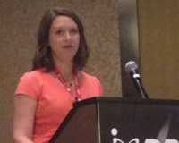
Kim Foucher speaking to Drive 15 Conference in Las Vegas.
The credit union retained Seattle-based Weber Group to lead the rebranding effort. One of the first steps it took was to identify the personality traits it wanted to represent and embody:
- Independent and nonconformist.
- Spunky and courageous
- Committed to a sense of craft and authenticity
- Nimble and flexible
- Social and passionate.
In other words, Portland.
“We decided to own who we were, as well as what we are not--traditional, sterile, corporate and bureaucratic--which a lot of financial institutions are.”
It also decided to own the unique personality of Portland, where locals take pride in the ethos “Keep Portland Weird” and in being independent, free-thinkers.
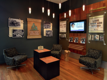
The redesigned interior of Trailhead Credit Union.
“We defined our target market as the Urban Portlander,” said Faucher. “It’s a diverse group, but it’s all proud Portlanders who embrace individuality and support local businesses. They don’t like ‘the man,’ and it’s a niche market that few others are targeting.”
Faucher said that as part of its research the credit union looked at other successful businesses in its market, some of which were also inconveniently located, but which also shared certain values, such as irreverence and pride in handcrafted goods. (On a per-capita basis, Portland has more microbreweries than any other city in the U.S.)
“Our position is that we are a locally owned, independent, boutique financial institution. Many in our market will go out of their way to avoid big chain stores. In choosing a name we wanted to have something that sounded like it was from the Northwest without using ‘Northwest.’ We wanted it to feel local and give us the opportunity to tell as story. The name Trailhead really appeals to urban Portlanders, who love the outdoors, and it also allows us to tell the story of helping them on their path to financial success.”
With the new name came the came a new tagline: “Small enough to know better.”
“We are the perfect banking alternative for the individual spirit of Portland,” said Faucher.
An Intentionally 'Unpolished' Look
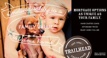
Trailhead Credit Union has intentionally worked to give its marketing an “unpolished” look. It’s logo resembles that of a pub, and it uses candid photos of real Portlanders in its messaging.
Its main branch was given an overhaul, and its dress code was changed to be casual and comfortable. Employees can wear jeans, but are required to also wear solid, neutral-colored shirts. “Piercings and tattoos are OK,” said Faucher. “Our employees look like our members.” Indeed, it gives out temporary logo tattoos in its lobby rather than stickers or lollipops, Faucher added.
In January of 2014 Trailhead opened its second location on a street populated by independent boutiques. The front of the branch is a garage door and is opened with the weather is good. Reclaimed wood was used in the construction, and the branch includes a large chalkboard used as a community calendar.
What has been response?
“It has exceeded all our expectations,” said Faucher. “Net membership is up 24%. Net loan dollars are up 35%. We had been averaging 30 new account sper month, now that is 130. The average age of our members is now 45, down from 47.”